Question: The Faces of Science Fiction
Jan. 2nd, 2014 07:06 pmI could figure out answers to the following questions, given enough time-- but among my correspondents, I suspect, are people who are capable of answering them in the blink of an eye.
What typeface might this be? And more to the point, what is the closest typeface, let's say in my Microsoft Office collection, I could use to approximate its appearance?
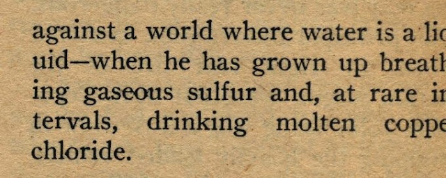
Image courtesy Science Fiction Collection, Rare Books and Special Collections, Northern Illinois University
What Office typefaces would be good choices to fake some of the typefaces visible here?
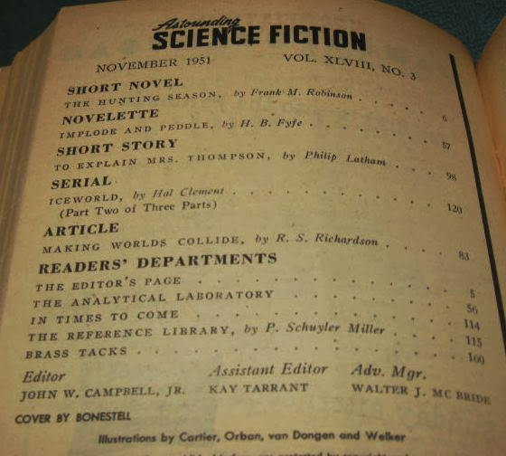

What typeface might this be? And more to the point, what is the closest typeface, let's say in my Microsoft Office collection, I could use to approximate its appearance?
Image courtesy Science Fiction Collection, Rare Books and Special Collections, Northern Illinois University
What Office typefaces would be good choices to fake some of the typefaces visible here?
Question: The Faces of Science Fiction
Date: 2014-01-03 01:36 am (UTC)no subject
Date: 2014-01-03 01:51 am (UTC)no subject
Date: 2014-01-03 02:00 am (UTC)no subject
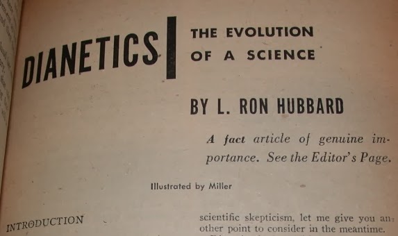
Date: 2014-01-04 01:54 am (UTC)The DIANETICS title and similar things are a narrow-width version of some "grotesque" sans, like Aksidenz Grotesk /AG Old Style or similar (but probably not exactly that). It needs to be a version designed for narrow width, not a normal-width one that has been optically or digitally squashed (a modern barbarism).
no subject
Date: 2014-01-03 02:04 am (UTC)For the all-caps headlines, I'm looking at Impact, but maybe something closer can be found. (Would be odd to imagine L. R*n H*bb*rd speaking LOLcat-ese in 1950.)
I stole this
Date: 2014-01-03 01:55 am (UTC)no subject
Date: 2014-01-03 02:16 am (UTC)no subject
Date: 2014-01-03 07:00 pm (UTC)I have Century Oldstyle as a Type 1 font -- and I confirm that that's the correct one.
I thought the "OF HUMAN MEMORY" might by Futura Condensed, but the "M" on that is wrong. However, I agree that ToC bottom-of-page text is probably Futura -- the open "a," round "O," and short x-height are good indicators.
"THE EVOLUTION OF A SCIENCE" is not Gill Sans, though it is close. I tentatively agree with Johnston Bold as an identification.
Assuming "DIANETICS" and "OF HUMAN MEMORY" are the same font, the best identifier is going to be the "C" in "DIANETICS" -- that's quite distinctive.
no subject
Date: 2014-01-03 07:48 pm (UTC)If you're looking to fake it, I think you already have your answers.
I am. See comment lower down with a sample of fake fonts. The Century I have differs from Century Oldstyle. Maybe I can find a version to download.
the best identifier is going to be the "C" in "DIANETICS" -- that's quite distinctive.
The "C" in League Gothic looks identical to me.
no subject
Date: 2014-01-04 01:57 am (UTC)no subject
Date: 2014-01-03 02:17 am (UTC)Most of the sans serif stuff except the masthead seems to be variations on Helvetica except "THE EVOLUTION OF A SCIENCE" which looks more like Gill to me. Gill is not one of The Fonts. Helvetica again would look pretty close, but not nearly perfect.
no subject
Date: 2014-01-03 02:29 am (UTC)no subject
Date: 2014-01-03 02:47 am (UTC)And yes, I think Impact is a better fit for the rest of the sans if you have it.
no subject
Date: 2014-01-03 03:41 am (UTC)no subject
Date: 2014-01-03 02:28 am (UTC)Mind you, there's a passel of typefaces that look kinda like Helvetica.
no subject
Date: 2014-01-03 02:30 am (UTC)Now I wonder what typeface I am thinking of?
no subject
Date: 2014-01-03 04:04 am (UTC)for against a world - try Bookman
no subject
Date: 2014-01-03 04:15 am (UTC)no subject
Date: 2014-01-03 04:17 am (UTC)no subject
Date: 2014-01-03 05:38 pm (UTC)no subject
Date: 2014-01-03 05:01 am (UTC)no subject
Date: 2014-01-03 12:06 pm (UTC)I'm struck by the darkening color of the paper. From this I deduce Bill's home, or at least his library, must smell wonderful. Ah, the vanilla scent of old bookshops.
no subject
Date: 2014-01-03 03:03 pm (UTC)(Until such time as NIU acquires a scent-scanner, and can waft the essence of old Astoundings into my home.)
In some of these images, however, I stretched the contrast, which may have darkened some pages artificially...
no subject
Date: 2014-01-03 05:01 pm (UTC)no subject
Date: 2014-01-03 05:23 pm (UTC)no subject
Date: 2014-01-03 05:44 pm (UTC)Not sure what to do about it...
no subject
Date: 2014-01-03 07:08 pm (UTC)no subject
Date: 2014-01-03 03:10 pm (UTC)no subject
Date: 2014-01-03 04:31 pm (UTC)That smell is aversive for me, however; it's associated with watering eyes and asthma attacks. Reading old books is a hazard I have to endure sometimes, but ideally the room they're in would have powerful filters keeping the allergens from accumulating.
no subject
Date: 2014-01-03 02:52 pm (UTC)no subject
Date: 2014-01-03 04:32 pm (UTC)no subject
Date: 2014-01-04 12:40 am (UTC)I can point out that there are web sites with preposterous quantities of downloadable fonts, like dafont and Font Squirrel.