An Astronomical Disappointment
Jul. 31st, 2007 06:49 pmRecently, Patrick Nielsen Hayden linked to an essay about the artwork on the new U.S. passports.
I learned that alongside images of flags, Liberty Bells, Mt. Rushmore Presidents, and so forth, the passport has a bit of astronomical art.
I love the idea of illustrating America's exploration of space on our coins, stamps, and passports[1], so at first this seemed exciting. Soon, it seemed disappointing.
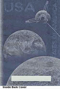
It's Pioneer 10, or maybe 11, mighty close to the Moon, with the Earth in the background[2]. I will leave it as an exercise for the student to prove that the point of view is about 450,000 kilometers from the Earth.
The Moon shows realistic detail, but, curiously, the Earth does not. There is not a cloud to be seen. Instead we see the outline of North America. It looks like a scene from a 1950s science fiction movie, before artists understood that the Earth really looks fairly fluffy and white when seen from space.
Also, the terminator appears to run from Kiribati in the Pacific to the Cape Verde Islands in the Atlantic. The subsolar point is near the northern Yukon. I haven't done the math, but this seems wrong for a planet inclined 23.5 degrees to its orbital plane.
Now if you go a-googling for a picture of Pioneer 10, you will soon find a 1981 NASA publication called A Meeting with the Universe, which contains this interesting painting:

It appears to have exactly the same composition of Earth, Moon, and Pioneer; even the RTGs and magnetometer boom are posed at the same angle.
But it shows the Earth with dark ocean and white clouds, quite realistically, and if there is a landmass visible, I can't make out what it is. On the Moon, the dark feature at the bottom edge of the picture might possibly be Mare Moscoviense.
[Edited later to add: Heck, no-- central peak, irregular dark floor-- it's gotta be the mighty crater Tsiolkovsky. The artist knew his way around Farside, and I didn't.]
Obviously, the new passport image is a "swipe" of the old NASA painting. If the old painting was created for NASA, it is copyright-free (by NASA policy), and there are no legal restrictions on creating a derivative work based on it.
Conceivably, the State Department might even have asked the same artist to recreate it for the passports. Though I like to think that someone with the talent to do the NASA painting would object to portraying a cloudless Earth with an alarmingly canted terminator.
Who is the artist who painted the NASA illustration? (Ron Miller? Don Davis? David Hardy?)
Who is the artist who created the passport illustration?
Can you find a better-quality rendering of the passport artwork online? Or slap a new passport onto a scanner?
(By the way, here's an essay on the aesthetics of the new passport illustrations.)
[1] And I encourage other nations to do the same with their own space achievements.
[2] I doubt either Pioneer came quite this close to the Moon, but I have to allow the artists some license...
I learned that alongside images of flags, Liberty Bells, Mt. Rushmore Presidents, and so forth, the passport has a bit of astronomical art.
I love the idea of illustrating America's exploration of space on our coins, stamps, and passports[1], so at first this seemed exciting. Soon, it seemed disappointing.
It's Pioneer 10, or maybe 11, mighty close to the Moon, with the Earth in the background[2]. I will leave it as an exercise for the student to prove that the point of view is about 450,000 kilometers from the Earth.
The Moon shows realistic detail, but, curiously, the Earth does not. There is not a cloud to be seen. Instead we see the outline of North America. It looks like a scene from a 1950s science fiction movie, before artists understood that the Earth really looks fairly fluffy and white when seen from space.
Also, the terminator appears to run from Kiribati in the Pacific to the Cape Verde Islands in the Atlantic. The subsolar point is near the northern Yukon. I haven't done the math, but this seems wrong for a planet inclined 23.5 degrees to its orbital plane.
Now if you go a-googling for a picture of Pioneer 10, you will soon find a 1981 NASA publication called A Meeting with the Universe, which contains this interesting painting:
It appears to have exactly the same composition of Earth, Moon, and Pioneer; even the RTGs and magnetometer boom are posed at the same angle.
But it shows the Earth with dark ocean and white clouds, quite realistically, and if there is a landmass visible, I can't make out what it is. On the Moon, the dark feature at the bottom edge of the picture might possibly be Mare Moscoviense.
[Edited later to add: Heck, no-- central peak, irregular dark floor-- it's gotta be the mighty crater Tsiolkovsky. The artist knew his way around Farside, and I didn't.]
Obviously, the new passport image is a "swipe" of the old NASA painting. If the old painting was created for NASA, it is copyright-free (by NASA policy), and there are no legal restrictions on creating a derivative work based on it.
Conceivably, the State Department might even have asked the same artist to recreate it for the passports. Though I like to think that someone with the talent to do the NASA painting would object to portraying a cloudless Earth with an alarmingly canted terminator.
Who is the artist who painted the NASA illustration? (Ron Miller? Don Davis? David Hardy?)
Who is the artist who created the passport illustration?
Can you find a better-quality rendering of the passport artwork online? Or slap a new passport onto a scanner?
(By the way, here's an essay on the aesthetics of the new passport illustrations.)
[1] And I encourage other nations to do the same with their own space achievements.
[2] I doubt either Pioneer came quite this close to the Moon, but I have to allow the artists some license...
no subject
Date: 2007-08-01 12:59 am (UTC)Of course, the book is also about anthropomorphic animals' bedtime routine on what appears to be a derivative of Noah's Ark, but for some reason I don't mind that.
(no subject)
From:(no subject)
From:no subject
Date: 2007-08-01 01:13 am (UTC)I'm very happy that I renewed mine recently, meaning that I don't get "chipped" until 2014. (Unfortunately, the Irish passport expires next year, though the fact that that one is hand-written and therefore not even OCRable still makes me happy.)
no subject
Date: 2007-08-01 01:23 am (UTC)Why, the U. S. of A., of course.
Those pesky clouds in their realism obscured the most important thing in the picture, so of course they had to go.
For NASA, the subtext is supposed to be science.
For the State Department, the subtext is the aggrandizement of the nation.
(no subject)
From:(no subject)
From:(no subject)
From:(no subject)
From:(no subject)
From:(no subject)
From:Pioneer F and G(Prelaunch designations)
Date: 2007-08-07 03:30 am (UTC)no subject
Date: 2011-04-08 09:07 pm (UTC)..."Who is the artist who painted the NASA illustration? (Ron Miller? Don Davis? David Hardy?)"
It is almost certainly not the work of any of those great astronomical artists. If I were to hazard a guess (based on the style and technique, as difficult it is to judge from the small image) two of the top three candidate possibilities would actually be great WOMEN astronomical artists. No, I won't say who I think may be responsible for this work. But try posting an inquiry at the International Association of Astronomical Artists. I'm sure there will be folks there who can solve the mystery.
(no subject)
From:(no subject)
From: (Anonymous) - Date: 2013-11-06 09:21 am (UTC) - Expandno subject
Date: 2013-11-05 08:14 pm (UTC)no subject
Date: 2014-06-09 05:57 pm (UTC)